Tableau is one of the best-known analytics platforms for visualizing business performance. It helps teams organize data, monitor KPIs, and explore trends through dashboards, reports, and guided analysis. Tableau Pulse extends that with personalized, AI-powered metric insights delivered in the flow of work.
But even with those advances, Tableau’s core value remains analytics: understanding what happened, spotting changes, and exploring possible drivers.
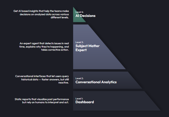
Bicycle is built for a different job. Instead of stopping at insight, Bicycle is designed to close the loop from signal to root cause to action. In Bicycle’s own architecture, the progression is explicit: static reports are Level 1, conversational analytics are higher, and Bicycle’s target state is an expert agent that detects issues in real time, explains why they are happening, and helps trigger corrective action.
That difference matters because modern revenue problems rarely look like dramatic outages. More often, they are unseen failures: a checkout page that is a few hundred milliseconds slower on one device, a partner feed that drifts out of sync in one region, an approval-rate drop on one issuer, or an inventory mismatch that affects only a narrow slice of traffic. In isolation, each issue looks small. At scale, each one leaks money.
Bhaskar Sunkara, Bicycle’s founder & CEO, frames this clearly:
“Speed is the new margin protector.”
Tiny percentage shifts multiplied by large transaction volumes become real financial loss.
The simple answer
If you want to know what happened, Tableau is strong.
If you want to know what happened, why it happened, what to do next, and how to route that action safely, Bicycle is the better fit.
Why dashboards alone are no longer enough
Most analytics stacks were built for hindsight. They tell teams that revenue is down, conversion slipped, refunds rose, or margin compressed. That’s useful, but it’s only the first step.
Bicycle’s benchmark report on revenue leaks shows the operational gap clearly. In a survey of 158 respondents, 56.3% said they were highly confident their organization could detect most revenue-impacting issues in real time. But only 16.5% said they could fix the issue in under an hour.. More than half of respondents also said customer reports surface incidents before internal detection either always or most of the time.
That gap is exactly where static analytics breaks down. A dashboard can highlight a KPI shift, but it usually can’t assemble the full story across business data, technical signals, operational context, and downstream workflows quickly enough to stop the loss.
Revenue leak reality: detection is faster than resolution

Source: Bicycle.ai Industry Benchmark on revenue leaks.
This is the core Bicycle argument: the market does not need more charts as much as it needs a faster loop from detection to diagnosis to action. Bhaskar says that many teams can notice a problem quickly, but fixing it still takes too much time because the organization has to “stitch together the story across systems and teams.”
Tableau vs. Bicycle: a practical comparison
Tableau
Tableau is an analytics and BI platform from Salesforce. It excels at data visualization, dashboards, reports, guided exploration, and AI-assisted metric insights. Tableau Pulse can push contextual metric summaries and help users explore key drivers. Tableau also supports dashboard actions and integrations, including external actions in some workflows.
Bicycle
Bicycle is designed as an operational AI layer on top of the tools a company is already using. It connects data and business KPIs together in order to create operational context and identify problems extremely quickly. Bicycle can detect a change, investigate likely drivers, recommend the next best action, and route that action to the right channel or system. Bicycle describes this as moving from “what” to “why” to “action” instantly.
The architectural difference: snapshot analytics vs. live operational context
A useful way to compare the two is this:
Tableau gives you a historical or near-real-time snapshot of performance.
It is excellent for monitoring trends, segmenting results, analyzing cohorts, and helping humans interpret the data. Tableau Pulse makes that process more proactive and accessible, but it still centers on metric exploration and guided insight.
Bicycle gives you a connected operating model for resolution.
Its value is not just that it sees the metric move, but rather that it can relate that movement to technical and operational causes then help the organization act before the leak becomes expensive. Bhaskar describes Bicycle as “the drivetrain that connects both wheels”: technical performance on one side and business performance on the other.
That distinction becomes critical in complex environments where the root cause is fragmented across systems. A conversion drop might be caused by inventory drift, a slow release, a gateway issue, a partner API failure, a pricing mismatch, or a combination of all five. A dashboard usually tells you that conversion is down. Bicycle is positioned to tell you why, in which slice, and what small reversible action should happen next.
What Bicycle adds that dashboards typically do not
1. Events
Bicycle starts from event-level signals rather than only aggregate reporting. In its architecture examples, events include actions such as login, search, booking confirmed, payment confirmed, payment error, and cancel booking. This approach is critical because revenue leaks often hide in the event stream before they become obvious in executive-level KPIs.
2. Dimensions
Bicycle also models the dimensions that give events operational meaning: city, device type, user type, program, hotel type, geography, payment method, and many more. This lets the system narrow an issue to the slice that actually matters, such as a specific route, issuer, device, region, SKU cluster, or customer cohort.
3. Ontology and shared business context
The real unlock is what Bicycle calls an ontology. This is where Bicycle is able to take all of an organization’s data and information to create an action-oriented model – everything from patterns, signals, causes and actions – all represented in the same system. In doing so, Bicycle can take truly unique action – for example, interpreting a drop in bookings as not just as a number, but as an operational story with recommended next steps.
4. Actionability
A dashboard may tell you search conversion is down, but it usually does not tell you which likely driver matters most, and it definitely does not run the test automatically. Humans still do that manually across systems. Bicycle’s promise is to surface the likely causes and then drive simple, practical actions that plug revenue leaks.
Some examples might include:
- Reranking in-stock alternatives when inventory is the issue
- Refreshing cache slices when stale results or fares are causing friction
- Routing payments to a healthier path when one PSP or BIN range degrades
- Creating Jira tickets, alerts, or notifications for the correct owner
- Applying safe, reversible mitigations with rollback and audit trails
A side-by-side approach for evaluating Bicycle vs. Tableau
Use Tableau when:
You need trusted dashboards, historical analysis, KPI reporting, self-service BI, and broader organizational visibility into trends and performance. Tableau remains strong for analytics consumption and exploration across many business functions.
Use Bicycle when:
You need to reduce mean time to resolution, connect fragmented business and technical signals, detect silent revenue leaks in narrow slices, and move from “something changed” to “here is the likely cause and the next step” without waiting on multiple teams to manually connect the dots.
Use both when:
You already have dashboards, warehouses, monitoring tools, and workflow systems, but you need an operational layer on top. Bicycle.ai doesn’t claim to replace the existing warehouse, dashboards, or monitoring stack; rather, it sits across the entire environment and provides the connective tissue across all of it, including disparate teams (business and operations).
| Tableau | Bicycle |
|---|
| Shows historical performance through dashboards, reports, and metric views. Good for understanding business outcomes over time and tracking known KPIs. | Connects live signals across a fragmented environment including business events, technical telemetry, operational context, and workflow systems so teams can understand what is changing as it happens. |
| Helps teams analyze trends and KPIs by visualizing performance, segmenting results, and enabling guided exploration. Best when users know what they want to measure and how they want to break it down. | Helps teams move from signal to diagnosis to action by identifying meaningful changes, localizing them to the affected slice, surfacing likely causes, and recommending the next best step. |
| Best for dashboards, reporting, business reviews, and structured analysis. Tableau is strong when organizations want broad visibility, self-service analytics, and consistent reporting across teams. | Best for real-time operational detection and response. Bicycle is designed for dynamic environments where problems emerge quickly, hide in narrow slices, and require fast explanation before they become meaningful revenue loss. |
| Highlights where overall performance changed and helps analysts drill into dimensions, trends, cohorts, and comparisons. | Detects anomalies even when top-line metrics still look healthy by watching event-level behavior, dimensions, and business context continuously rather than relying on broad averages alone. |
| Depends on people knowing what to monitor. Dashboards, alerts, and slices are typically defined in advance by analysts or business users. | Looks for what teams may not know to ask for yet. Bicycle is designed to continuously detect unexpected deviations, emerging patterns, and hidden concentration in live data. |
| Supports investigation through charts, reports, and drill-downs, but the burden of interpretation still sits largely with the human analyst. | Adds context on why performance changed by connecting shifts in KPIs to likely operational, technical, behavioral, or partner-related causes across systems. |
Bottom line: Tableau is most valuable when the goal is visibility and analysis. Bicycle is most valuable when the goal is early detection, fast explanation, and revenue protection in motion.
Another useful way to compare Bicycle and Tableau is by persona. Tableau is often strongest for people whose job is to monitor, report, and analyze. Bicycle is strongest for people whose job is to resolve, recover, and coordinate action across fragmented systems and teams.
Business owners and operational leaders
| Persona | What they typically need | Tableau value | Bicycle value | Why Bicycle stands out |
|---|
| Head of Payments / Payments Ops leader | Visibility into approval trends, payment method performance, PSP health, and top-level KPI changes | Strong for dashboarding approval rates, trends, cohorts, and historical review | Detects approval drops by BIN, issuer, region, method, and time of day; separates issuer issues from gateway/config drift; recommends routing or policy action | This persona usually does not just need reporting. They need faster recovery, lower cost per approval, and safe next steps such as failover, retry tuning, or 3DS adjustments. |
| VP/Head of eCommerce or Digital | Revenue visibility across conversion, checkout, promo, inventory, and customer experience | Strong for KPI reporting, merchandising dashboards, and trend analysis | Connects checkout, promo, payment, inventory, and site/app signals to identify the likely cause and recommend the next action | Bicycle is better suited when the issue spans teams and systems, such as promo conflicts plus payment friction plus inventory mismatch creating a conversion leak. |
| Merchant Success / Partnerships lead | Early warning on account health, QBR proof points, and operational issues affecting merchant performance | Useful for account dashboards and business reviews | Surfaces merchant-specific dips, likely causes, and evidence-backed actions such as BIN failover or routing changes | Bicycle helps this persona move from "the merchant has a problem" to "here is the likely driver and the recommended fix," which supports renewals and upsells as well as faster resolution. |
| Product / Routing / Authorization manager | Understand policy performance, compare cohorts, and measure the impact of routing or retry changes | Good for historical comparisons and experimentation readouts | Helps test routing/policy variants by issuer, BIN, or merchant cohort and promotes measured next-best actions | Bicycle is more valuable when the team wants to operationalize policy learning continuously, not just review it after the fact. |
| Reliability / Payments Engineering / SRE lead | Detect failures quickly, reduce incidents, and isolate connector or webhook issues | Helpful for incident dashboards and service trend monitoring | Detects retry storms, missing idempotency keys, connector drift, timeouts, and degraded routes; supports bounded mitigations and rollback | This persona benefits from Bicycle because it ties technical degradation directly to approval, settlement, or revenue impact, not just system health metrics. |
| Revenue / Operations executive | Protect revenue, reduce firefighting, and improve response speed across teams | Strong for executive visibility and business reviews | Gives a faster operating loop from signal to diagnosis to action, with clearer owners and safe, auditable changes | Bicycle is aligned to the executive problem described in the benchmark report: many teams can detect issues, but far fewer can identify root cause or fix them in under an hour. |
For data and analytics teams, Tableau is often the system of record for visibility. Bicycle is the operational layer that helps those same teams turn standardized data into faster diagnosis, clearer accountability, and action that the business can actually take.
Data and analytics leaders
| Persona | What they typically need | Tableau value | Bicycle value | Why Bicycle stands out |
|---|
| Head of Data and Analytics | Standardized reporting, trusted definitions, fewer ad hoc requests, and better support for business teams | Excellent for BI, dashboard creation, self-service reporting, and metric visibility | Adds automated checks, short notes on what changed/why/next step, and action-oriented outputs for operators | Bicycle is attractive here because it reduces repeated "why did X spike?" requests and turns data work into operational leverage, not just reporting throughput. |
| BI / Analytics team | Cohort analysis, historical trends, dashboard maintenance, and stakeholder reporting | Core strength: dashboards, exploration, recurring reports, executive packs | Layers operational context on top of events, dimensions, KPIs, causes, and actions | Tableau remains the better fit for classic BI. Bicycle becomes valuable when the organization wants to move from insight delivery to operational decision support. |
| Data engineer / data platform team | Reliable pipelines, normalized definitions, and less reactive ticket traffic | Supports downstream consumption of modeled data | Benefits from Bicycle's emphasis on normalized events, dimensions, and shared business context | Bicycle's event-and-dimension model is useful because revenue leaks often hide in narrow slices before they appear in aggregate KPIs. |
| Data scientist / advanced analytics lead | Pattern detection, root-cause investigation, anomaly analysis, and modeling support | Useful for surfacing trends and analysis outputs to the business | Gives a more operational framework where models support detection, triage, cause ranking, and recommendation | Bicycle is a stronger fit when the goal is not just finding patterns, but making them usable in near-real-time operational workflows. |
| Chief Data Officer / analytics executive | Consistency, trust, scalability, lower manual effort, and better business adoption | Strong for enterprise reporting and shared KPI visibility | Helps unify business and operational signals into one story: what changed, why, and what to do | Bicycle is compelling when the data leader is trying to reduce fragmentation, shorten time-to-action, and make analytics more directly useful to operators and line-of-business teams. |
Example: how the two systems would behave differently
Imagine bookings fall 12% on a weekday evening across a set of high-traffic routes while re-prices are increasing.
In Tableau, a dashboard would likely show the drop, the affected region, the time window, and maybe related trend lines. A good analyst could investigate slices, compare periods, and identify potential correlations. That is valuable, but the team still has to pull together the business view, technical logs, partner data, and action path.
In Bicycle, the system is intended to connect that signal to likely drivers such as stale fare data, supplier latency, algorithm changes, or attribution discrepancies, then trigger actions such as a cache refresh, a fallback route, an alert to the right Slack channel, or a Jira ticket for the responsible team. That is the difference between a dashboard-driven workflow and a resolution-driven workflow.
The business case: why this matters now
The benchmark data suggests companies do not mainly struggle with seeing numbers. They struggle with integration complexity, data quality, fragmented ownership, and the time it takes to move from detection to fix. That’s why Bicycle doesn’t argue that dashboards are useless; rather, the company believes that dashboards are incomplete for modern revenue operations.
Final perspective
The difference between Bicycle and Tableau is not just that one supports action after insight. It is that they are built for fundamentally different operating environments.
Tableau is excellent for organizing data, visualizing performance, and helping teams analyze what happened. It is powerful when people know what they want to measure, how they want to segment it, and which dashboards they need to monitor.
Bicycle is built for a harder problem: the reality that modern revenue issues are often dynamic, narrow, fast-moving, and easy to miss unless someone already knows exactly where to look. In those environments, the challenge is not just seeing metrics. It is continuously detecting unexpected changes across live event streams, dimensions, and business context — even when no one thought to build the dashboard in advance.
That is why Bicycle is better understood not as another analytics surface, but as a real-time operational intelligence layer. It is designed to watch the business continuously, identify meaningful deviations as they emerge, connect them to likely causes, and help organizations respond before a small issue becomes material revenue loss.
Tableau helps you see the business you already know how to measure. Bicycle is built to detect the revenue problems you did not know to look for — while there is still time to fix them..
FAQ: Bicycle vs. Tableau
1. What is the biggest difference between Bicycle and Tableau?
The biggest difference is that Tableau is primarily an analytics and visualization platform, while Bicycle is designed as a real-time operational intelligence system. Tableau helps teams monitor metrics, analyze trends, and explore known questions. Bicycle is built to continuously detect meaningful changes across live business signals, explain what is likely happening, and surface the next best response.
2. Why are dashboards not enough for modern revenue operations?
Dashboards are useful, but they depend on people knowing what to monitor, how to segment it, and when to investigate. Many revenue problems do not appear as obvious top-line failures. They emerge in narrow, fast-changing slices such as one issuer, one route, one region, one SKU cluster, or one customer segment. In those cases, static dashboards often surface the problem too late or only after someone knows where to look.
3. Is Bicycle just a faster dashboarding tool?
No. Bicycle is not just about faster reporting or more attractive dashboards. Its value is in continuously watching live event and business data, relating signals across systems, and identifying patterns that would be easy to miss in traditional BI environments. The goal is not only to present data faster, but to make dynamic, real-time business behavior interpretable while it is still changing.
4. How is Bicycle different from BI or analytics platforms in general?
Traditional BI platforms are strong at reporting, trend analysis, historical exploration, and self-service analytics. Bicycle is designed for environments where the business is moving too quickly and too dynamically to rely only on prebuilt reports. It works across events, dimensions, and operational context so it can detect emerging issues and opportunities without depending entirely on analysts to constantly update dashboards and queries.
5. What kinds of problems is Bicycle better suited to detect?
Bicycle is better suited for subtle but expensive issues that hide inside real-time complexity: approval degradation in a narrow payment cohort, inventory or pricing mismatches affecting one segment, checkout friction on a specific device type, partner feed drift in one region, or a routing issue masked by stable averages. These are problems that often do not look dramatic at first, but can compound quickly at scale.
6. Can Tableau and Bicycle be used together?
Yes. Tableau can continue to serve as the visibility and reporting layer for business users and analysts. Bicycle can add a dynamic layer on top that continuously watches for emerging changes across the live operating environment. The two are complementary, but they solve different problems: one helps teams analyze the business, while the other is designed to keep pace with it and help solve revenue leaks quickly.